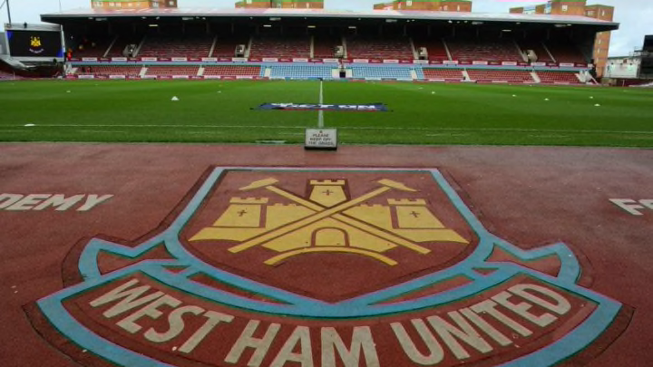
Watford have recently opened up the club’s badge design to the supporters, welcoming new badge ideas to be voted for which will be represented on next season’s kit. West Ham should look to do the same.
Claret pitch carpet – Check.
Historical artifacts and images around the exterior and interior of the stadium – Check.
Flags with previous badges waves around the pitch – Check.
Bubble machines on overdrive throughout the match – Check.
The club has taken some of the supporters’ concerns about the atmosphere around the London Stadium and implemented them to help make the new stadium feel more like home. The biggest issue the supports have, though, is the feeling of the club’s history having died with the club leaving Upton Park. Well, a new badge harking back to the glory days could help bring that history too.
The process from Watford was simple – fans were open to submitting new designs for the club’s logo for the 2020 season, and once narrowed down by the club a vote would be held against the current badge design. Unexcitingly, Watford elected to keep the Bullwinkle badge over a much sharper (IMO) Hornet and history badge.
More from Green Street Hammers - West Ham
- Brighton vs West Ham predictions: Can James Ward-Prowse help end the curse?
- West Ham and two Premier League rivals made huge transfer stand
- Lucas Paqueta bet allegations discussed in West Ham and Man City transfer talks
- Bournemouth vs West Ham predictions: Premier League opener amid transfer chaos
- West Ham near Denis Zakaria transfer after final James Ward-Prowse bid
In the words of a Watford fan, “If you’ve ever wondered why Watford are called the Hornets, yet have a moose on their badge; it’s because the animal is actually a hart, a male red deer, which is depicted on the Hertfordshire coat of arms where Watford is based (though many fans agree it looks very moose-like). The Hornets nickname stems from the late 1950s when Watford changed their kit colors from blue to black and yellow and supporters voted to change the nickname from The Brewers to The Hornets to reflect this change.
Watford opened the conversation about changing the badge due to the potential confusion it could cause international fans. ‘Why are you called The Hornets but have a moose on your badge?’ is probably the question I am asked the most as a Watford fan.
I was open to changing the badge, however, I voted to keep the current badge, as I didn’t like the shape of the new design and felt the hornet that was depicted wasn’t strong enough to stand out compared to other Premier League badges.
The current badge won the vote, so Watford will be remaining with the beloved moose. However, I personally wouldn’t be surprised if we see the badge change in the coming years.”
While the Watford story ended with the same badge, rest assured the West Ham vote would settle on a new design. The clean lines and simplicity of the current design are great, however, it doesn’t feel enough like the club and doesn’t represent enough history.
The perfect design, in my eyes, marries the old with the new. Keep the shape of the crest which is modeled after a cross-section of the HMS Warrior, but add in “East” above “London” and add the castle back behind the crossed riveter hammers.
Would you be open to a crest redesign for West Ham? If so, let us know what you’d like to see represented moving forward for the Hammers!
